Saturday 31 March 2012
Cut out animation refections
Looking for a little inspiration on storytelling, I found this nice cut out animation from the BBC film network. This piece is called "reflections", it was a col-aberration of the award winning computer effects and animation studio Framestore and the advertising UK based company Inflammerable directed by Sharon Lock and written by Diarmid Scrimshaw.
Analysis
What I really like about this piece and i think is quite interesting is how the mood in cut out animation can contribute alot to the animation itself. Cut out animation I think can be very abstract without purposely doing so, the look of the cut out characters in this piece visually communicate the man by marking out the features of his face and showing a clear silhouette of the character reflecting on his past, a simple, clean and clear design. The scenes, camera, position of the character and the shots (long shot mid shot etc) are all staged like a real film, but the characters are 2D. I think this shows how the silhouette of character be it, 2D 3D or live action can tell the audience what is happening in the scene and who the character is.
The 2D transitions in the piece give a strong, surreal, dreamlike atmosphere, such as the section where the man is walking down the street then splits in two too reveal his younger self, (perhaps metaphorically his inner child?) and even though the animation is limited to cut out animation, I think Lock and Scrimshaw have explored the 2D techniques so articulately and used transitions which have meaning to the concept of reflecting on the past.
I think the piece demonstrates alot of creativity, the transitions are beautifully executed, I really like the simplicity of the umbrella shadows in the background and the cut out houses.
Wednesday 28 March 2012
The Pirates! in an Adventure with Scientists
Little break today, I went to see Aardman's Pirates! on an adventure with scientists! based on Gideon Defore's series "The pirates" series. (2004: Pirates! on an adventure with scientists!) here's the taster of the
My review
I think the character designs have definitely stayed true to the craft, even updated onto a 3D computer animated platform but Aardman proved this before with the release of Flushed away. The one problem I had with this was that there were so many lovable characters each I think had the Wallace and Grommet unique quality and so articulate in design.
However I wanted to know a little about the captains crew, the cross-dresser? the drunk? even the fish dressed as a pirate had so much appeal, we are introduced to these characters at the very beginning and these characters for me they didn't appear as one-dimensional, simple characters; they have layers to them, which could have been unravelled more as the story progressed. Instead I think we are not given the full opportunity to "get to know them".
I don't think there would have been much empathy for the crew because of the little background but then, as an animator, the thought of the animation team squeezing another 10/20 minutes of animation for a little back story would make me feel more than enough sympathy to compensate.
Spoiler: The monkey I think had to be my favourite character and the flash cards gag worked so perfectly, I think the reason it worked so well was because of how the cards were presented in each of the scenes (the staging), how one particular shot, the Captain, Charles Darwin and Monkey all fall from the tower and the cards fall as a secondary action, spelling out the monkey's sentence. Has to be one of Peter Lord's classic visual gags.
For animation, I think the locomotion of the characters and visual effects reflect the physical limitations and movements of the clay animation Aardman are most famous for. The arms and legs move just like the original Wallace and Gromet plasticine models with the bendy metal wires inside and the 3D models reflect the Plasticine material. This must have so difficult to animate as the animation team ain't just animating characters, they have to simulate the plasticine material of the characters as well.
The entire film is elegantly pieced together in such a bizarre fashion (almost daft, but in a good way) and has that charming British timeless touch Aardman brings to all their films. A must see I say.
Tuesday 27 March 2012
Research - Timing
Interesting post thanks to Penny, previous web banners from animation mentor, they have priceless information on animation tips for timing, an area I need to work on quite alot.
I picked up a few notes and screenshots from the webanner for future reference:
MY NOTES


I picked up a few notes and screenshots from the webanner for future reference:
MY NOTES
Timing – how long it takes something to happen or not happen
Spaceing frame by frame displacements of moving elements within a certain time
24 frames = 1 sec
Basic timing
More frames = more slower movements
Less frames = faster movements
Basic spacing
Different spacing dependants the speed of the object – fast in slow out
Slow in slow out
Think of a car – start at 5mph, accelerate to 20mph to 50mph
More breakdowns are located at the beginning of the animation and the end with spacing in-between.
Anticipation – robots movie, strong poses determine strong antipation – hold a pose for at least a second to achieve strong anticipation – remember this when working on mime poses, especially the introduction
Overshoot – after effects of the sudden stop
when a character or parts of him pass the final pose then settle back into it.
Overshoot in the graph editor: first a line up, over the key poses key frame , then back down to the key frame. Put a key before the key pose and lift it higher than the keypose.
Consider materials. Toy story: Woody’s head is plastic but the body is cloth so there is overshoot in the head.
Weight: through time and space you can determine how light or heavy something is.
Bouncing ball:
Add more inbetweens makes a ball appear lighter and less frames to make a ball appear heavier. Use the tangents on the graph editor and lengthen for more air time and make them shorter for less.
Feeling
By varying you timing and spacing you can create feeling & mood
Ball bouncing: By varying one of the arcs of the ball, making it higher than the rest, creates an unexspected move, makes it feel playful.

Second ball the keys are tighter, timing is close together making the ball feel like it is in a rush no time to play around mess about.
Spacing the keys
Spacing the keys at the end gives the feeling of anger, he slams his hand down but before that he there are more keys in the arc.

Thursday 15 March 2012
Life drawing: babies
I took an hour out today and past two days to do a few observational sketches for the summer project this year, I had a few ideas in mind but I think I want the main character to be a baby or child-like character. I was inspired by Ed hooks, he made a very interesting point in the recent acting for animators newsletter and throughout the Animex workshop about babies, how little experience and knowledge they have. A baby has one goal when born which is to survive, learning becomes the action babies (or young children) act upon to meet this objective. I think we empathise with this objective as we've all exsperienced this situation before, we've all been young, helpless and I think it would be an interesting challenge to animate a child-like character.


The Sketches are from a few baby photo advertisements of babies using charcoal and graphite, looking into the proportions and "cute" poses for ideas for design ideas.


This sketch id from a baby model off youtube form Lon Harverly "you can draw" series, he talks a little about head proportions in the first part but more about drawing technique.
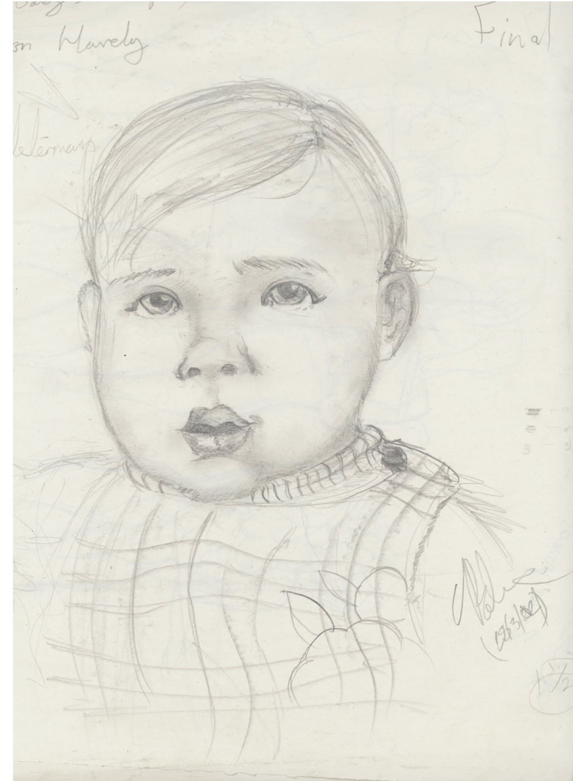
You can find more of Sketches from TV series "You Can Draw!" by Lon Haverly
www.lonhaverly.net
www.lonhaverly.net
Monday 12 March 2012
Life Drawing session
Today we had another life drawing session at 6 in the Athena building, I'm aiming to improve my drawing skills and the increase my ability to produce full figure drawing in a short space of time, practice makes perfect and i think i'm improving a little. I struggle alot with the 30 second sketches where I should be just drawing the gesture of the pose I sometimes will start to draw little details and run out of time.


"Gestures - 2 min poses"

I like to draw curvey lines, a technique I've been using alot when i produce drawing or sketches from life. I have to practice my shading a more to show form in the figure and reduce the amount of pencil strokes on a sketch, the more i practice the less lines i make and the better I capture the form.
Friday 9 March 2012
Intro reference/sketches - eating ice cream
Working on the introduction today with the group we talked about a few of the actions our characters are doing for the introduction scene. Harshali character is the leading character who whistles at the lady starting off our animation. So I went searching and found quite a few differnet gestures people use to eat iceream, I was looking over my refence clip (for reference) and found myself doing the same action over and over, people just dont eat ice cream this way. So I started observing a few youtube clips of commercials and people generally eating ice cream.
I've combined these with my own refence shot to come up with a few poses for the introduction scene, my character is stood further in the back as we planned out in the animatic. I sketched up a few gestures he could make in the introduction scene, I need more practice with maya so I've blocked out the poses using the norman rig, just a little practice.
http://www.youtube.com/watch?v=yk8_CuHkO9Y&feature=youtu.be

Wednesday 7 March 2012
Camera Script
Today we sat and discussed more about the female character in the scene. We wanted the ideas clear on the girl before the reference shoot tomorrow, we discussed her phases, reaction to the characters and gestures she would make, even though she's off camera we needed to plan out exactly what the character was thinking, her actions would affect the camera movements and reactions of the mimes.
We needed someone to read the script as the character for the reference shoot tomorrow, this would help us act out the reactions of the character. We also have to be aware of timing as in our previous reference shoots we've gone over the 30 mark for each mime. During the meeting typed up a script of her dialogue, actions and reactions to the mimes as guidance:

We needed someone to read the script as the character for the reference shoot tomorrow, this would help us act out the reactions of the character. We also have to be aware of timing as in our previous reference shoots we've gone over the 30 mark for each mime. During the meeting typed up a script of her dialogue, actions and reactions to the mimes as guidance:

Beach Babe Female character dialog:
Dialog/timing Reaction to Action
Beach Babe: “UGH” reaction to whistle
Harshali’s mime: Andrew
00:0014 – “What are you doing? Surprised/unwanted (wtf)
“ouch!” Hitting the glass
00:00:25 “ugh, NOOO” Reaction to the flower Disgust
my mime: Jake
00:00:42 “Are you kidding?” strokes his hair back
00:00:57 “uh oh” bang against glass/hands on face
00:01:07 “what was that?”/”seriously?” Jake walking off set
Alper mime: bob
00:01:18 “Mmmmm” Bob flexing Impressed
0:01:42 – undecided giving the gifts Totally impressed
Suggestions:
“AWWW so sweet”
“Yes!”
“okay"
We have officially tagged the girl as "beach babe" for the time being, we've also decided to change some of the ideas around for the characters as this would work better for the scene. Originally my character, the vain cool type, would after presenting his gift bang into the wall humiliating himself in front of the girl, but we decided that possibly Harshali''s character should perform the action to establish the wall at the beginning of the scene. We didnt want to use the same gag twice in the scene, my character would not be aware of the wall but the audience is so it wouldn't work for my character to bang into he wall too.
Instead my character could stop and react to the wall with a suggestion James made last week (James the actor from the green screen session last week) to move across the wall, this would add a comedic factor to my character, who is quite obviously full of himself. We emailed Siobhan regarding this idea so we shall see how the session goes tomorrow.
Tuesday 6 March 2012
The thinking character - My presentation
Here are the slides from my presentation, my topic was "the thinking character"


Monday 5 March 2012
The camera - concept and script
Long meeting today to discuss the camera and the type of character we what her to be. We first we thought about an older more sophisticated woman as Harshali and Apler suggested sunbathing in the beach, but as the project developed, we come with a much younger, more hip character for the girl. This week, we will be having another reference meeting session to finalise our ideas, Harshai has suggested we book the green screen again so we have booked a session at 1:00 on Thursday. I gathered a few images and created a mood board of what type of character the girl is:


With these images i did a finalised sketch of the character design:
Going for the casual California beach girl, this is a comedy sketch so it would be better for us to use this stereotype to suit the genre. I gave her a big lips and a wide mouth because she's going to be quite a loud character, this is for the timing and acting of the mimes, "acting is reacting" and the mimes need to react to her voice and personality in the scene or else the whole animation wont make sense. This character is playing the objective of the scene for the characters, so even though she is off camera the audience need to be aware of her existence as the camera. We've had feedback from the other groups with suggestions of looking at her nails or having sunglasses, i think we could do something with the hand but we have to be careful of time because we only have a few more weeks to complete the whole sequence.
Subscribe to:
Posts (Atom)